Give each screen a clear job
List the choices a customer needs to make: a main, a combo, a side or a drink. Group related items and keep names, descriptions and prices together. Across several screens, decide where each category belongs before enlarging a photo or adding another promotion. A customer should not need to search a different screen to understand an offer.
A real layout, explained: HomeStyle family combos
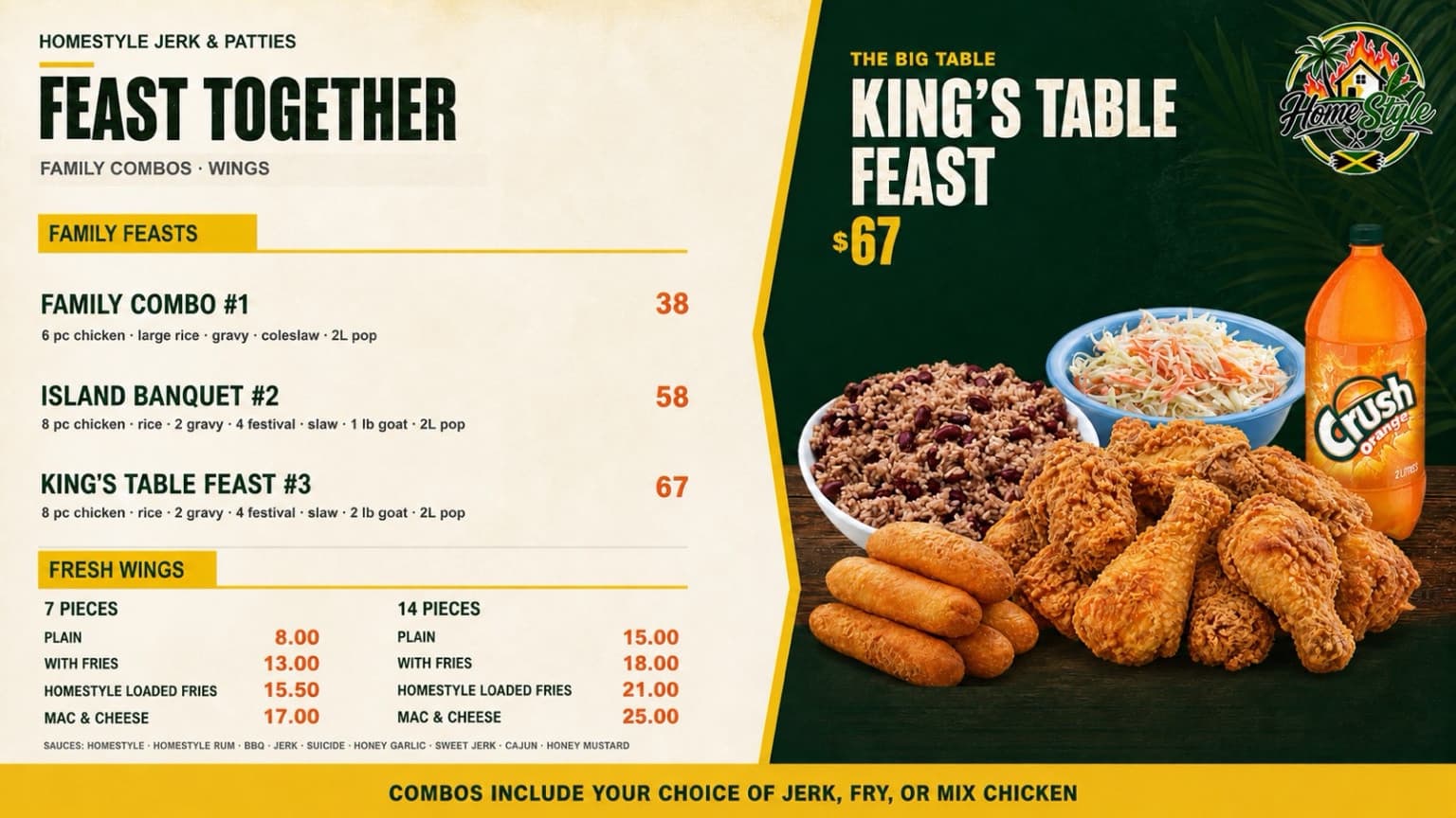
This HomeStyle Jerk & Patties board is one of the restaurant designs shown on our homepage. The left side holds the family-combo and wing choices; the right side gives one featured feast its own space. The annotations below explain visible design choices in the supplied artwork.
A clear category hierarchy
“Family Feasts” and “Fresh Wings” divide the choices. The larger “Feast Together” headline gives the whole board a theme without replacing the category labels.
Combo contents next to the choice
Each family combo lists its included food and drink directly beneath its name. The price sits on the same row, so the customer can compare complete choices.
One offer gets the spotlight
The King’s Table Feast has a separate headline and price in the darker panel. It is still listed with the other combos, connecting the feature to the full menu.
Imagery stays with the featured offer
The large food-and-drink image occupies the featured panel rather than interrupting the price list. Confirm that any image used represents the portion and presentation you serve.
Artwork shown as a design example. Its menu items and prices are not a current ordering menu. This is a layout walkthrough, with no before-and-after sales claim.
Turn your menu into a useful design brief
The most useful starting point is a complete menu and one clear priority for each board. Professional design then has a concrete job to do, with details your team can review before setup.
- Menu structure
- Supply item names, prices, sizes and what each combo includes. Flag differences between locations and service periods.
- Brand and imagery
- Provide your logo, colors and food photos you have permission to use. The food and portions shown should represent what you serve.
- Featured choices
- Choose which combo or add-on deserves attention and why. Leave enough space for regular menu choices to remain readable.
- Approval scope
- Agree on the number of layouts, revisions and formats in your quote, and name the person who signs off on wording, prices and imagery.
Check the design at the actual counter
A layout that looks clear on a laptop still needs to be checked at its intended size and viewing distance. Use the real screens, mounting positions and lighting whenever possible.
Read it from the queue
Stand where customers wait and order. Check category names, prices, combo inclusions and any smaller qualifiers.
Walk the full screen set
Make sure categories follow an understandable order and no price or description is separated from the item it belongs to.
Check light and motion
Look for reflections at different service times. If boards rotate, make sure a customer can finish reading before content changes.
Ask someone to place an order
Have them identify a meal, its included items and its price without help. Use the points where they hesitate to guide the next revision.
Plan how the design will stay accurate
Decide who checks prices, who handles an unavailable item and who approves a new promotion. Keep the final menu text and source photos together so later updates start from the right version. If a board changes for breakfast or lunch, review each service-period version as carefully as the main menu.
Measure the outcome consistently
Compare the featured item’s units sold, combo attachment and average order value before and after a layout change. Define average order value consistently as sales divided by completed orders, treating taxes, refunds, discounts and channels the same way each time. Use comparable days and note price, availability and other promotional changes. A higher sales total alone does not prove the design caused the increase.